本页面由 PageTurner AI 翻译(测试版)。未经项目官方认可。 发现错误? 报告问题 →
CSS 自定义
在 Dashboard > Branding 中,"自定义 CSS" 字段可用于覆盖 Jellyfin 样式表中的现有 CSS。
自定义 CSS 可实现颜色更改、布局调整、项目尺寸及行为修改等定制功能。下文列出多种可应用的调整方案。这些 CSS 调整适用于所有从服务器加载 Jellyfin-Web 的客户端。代码将按书写顺序生效,但 !important 规则具有最高优先级。要深入了解 !important 等概念,请参阅 CSS 优先级 或 specifishity。要应用这些更改,请前往 Dashboard > Branding > Custom CSS 开始操作。
若您对 CSS 了解有限或没有经验,可在线查找各类资源与教程。利用下文提供的调整方案和示例,您能轻松开始自定义 Jellyfin 实例。
CSS 基础知识
您可通过w3schools和MDN等网站深入学习 CSS。下文将介绍最基础的 CSS 知识,帮助您对预设调整方案进行初步修改。
颜色
CSS 支持多种颜色格式,但通常使用十六进制颜色代码表示特定颜色。要获取精确颜色,必须使用如下所示的十六进制代码等精确颜色数据。
十六进制颜色代码示例:
-
绿色:
#5dd000 -
蓝色:
#0000d0 -
红色:
#d00000 -
透明黑:
#00000058
使用HTML 取色器��可查找任意颜色的十六进制代码。
若需要更通用、非特定的颜色,直接输入颜色名称即可满足需求。例如要使用"黄色",只需输入"yellow",系统会自动调用预设黄色。
yellow 黄色
red 红色
aquamarine 碧绿色
lightseagreen 浅海绿色
可在W3Schools 颜色名称参考查看支持的完整颜色名称列表。
注释
位于/*和*/之间的代码或文本属于注释内容,将被系统忽略。
您可通过注释为代码段添加说明,
也可用于临时禁用代码而无需删除。
/* This might be added above code to tell you what it does */
CSS 链式调用
CSS 可通过"链式调用"同时修改多个不同区域。"边框颜色"调整方案即采用此方式:它列出所有待修改元素,并将变更统一应用于这些元素。
"边框颜色"调整方案:
.emby-input,
.emby-textarea,
.emby-select {
  border-color: #d00000;
}
调整方案列表
要应用以下任意调整项,请将示例中的 CSS 代码复制粘贴到“自定义 CSS”字段。如需使用多个调整项,只需在字段中依次添加即可。所有应用的代码将保留在字段中。要移除调整项,请从字段中删除或注释掉对应代码。更改在保存设��置页面后立即生效,无需重启 Jellyfin 服务器。
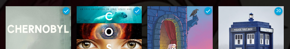
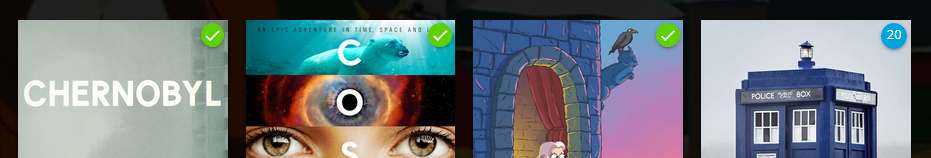
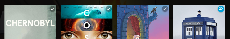
播放状态指示器
此设置将影响已播放/已观看指示器颜色。可用任意十六进制颜色值替换。
调整前的默认指示器
绿色指示器
/* Make watched icon green */
.playedIndicator {
  background: #5dd000;
}
半透明深色指示器
/* Make watched icon dark and transparent */
.playedIndicator {
  background: #00000058 !important;
}
透明计数指示器(例如剧集)
/* Make count indicator icon dark and transparent */
.countIndicator {
  background: #00000058;
}
在移动端布局显示外部链接
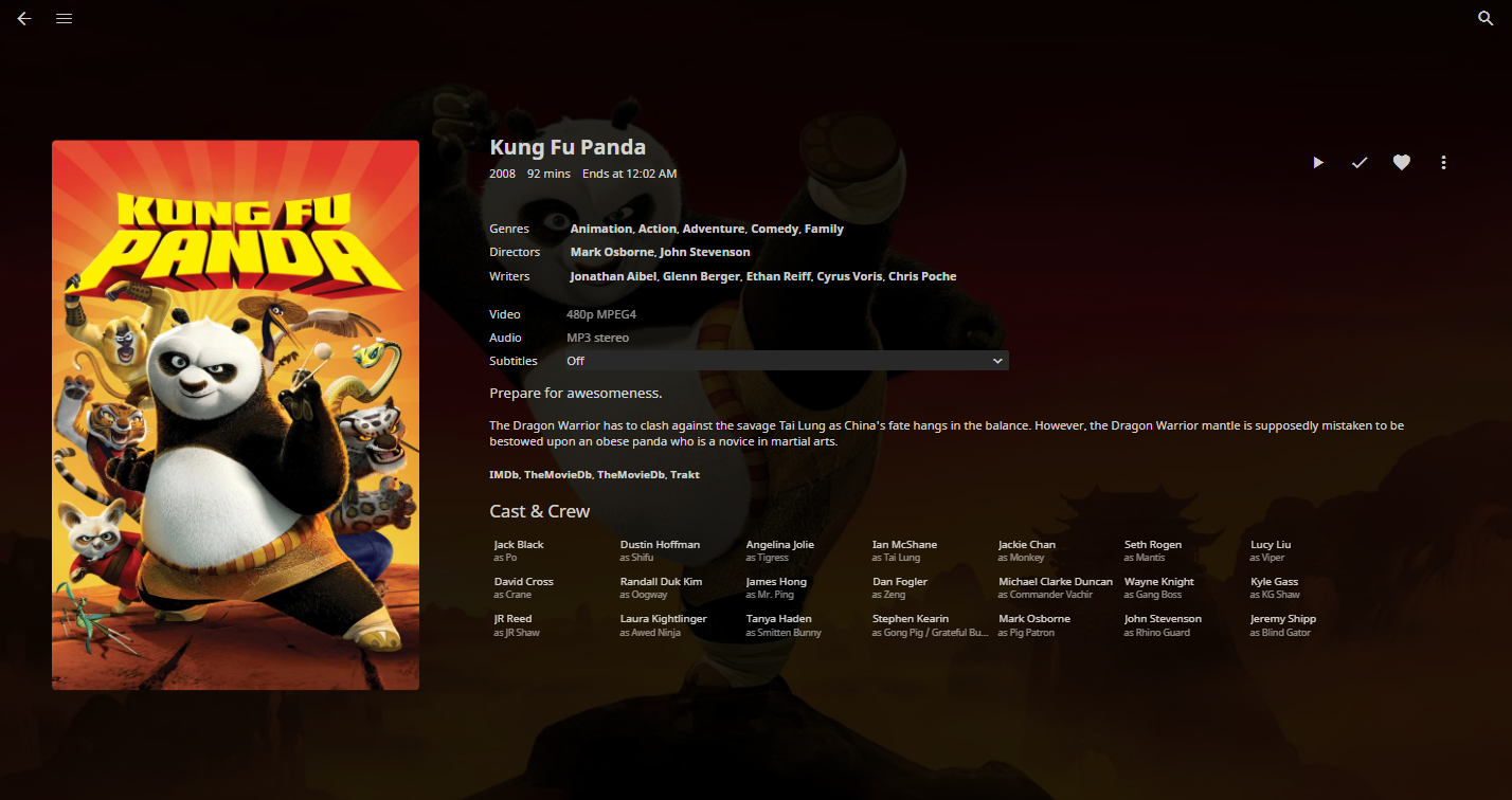
移动应用默认隐藏 IMDb、TheMovieDB、Trakt 等外部链接。添加以下代码片段可重新启用:
.layout-mobile .itemExternalLinks {
  display: block !important;
}
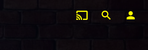
隐藏顶部导航栏首页图标
.headerHomeButton {
  display: none;
}

.headerButton.headerButtonRight.headerUserButton.paper-icon-button-light {
  display: none;
}
隐藏顶部导航栏投播图标
.headerCastButton {
  display: none;
}
隐藏顶部导航栏同步图标
.headerSyncButton {
  display: none;
}
隐藏顶部导航栏用户设置
.material-icons.person {
  display: none;
}
隐藏直播电视频道列表
.guideChannelNumber {
  display: none;
}
缩小直播电视频道宽度
.channelsContainer {
  max-width: 8em;
}
隐藏演职人员信息
#castCollapsible {
  display: none;
}
隐藏"更多类似内容"
#similarCollapsible {
  display: none;
}
隐藏"即将播放"
div.nextUpSection {
  display: none;
}
隐藏星级评分
div.starRatingContainer {
  display: none;
}
将"最新电影"文字替换为自定义文本(如"最近添加的电影")
#homeTab
  > div
  > div.section2
  > div:nth-child(1)
  > div.sectionTitleContainer.sectionTitleContainer-cards.padded-left
  > a
  > h2 {
  display: none;
}
#homeTab
  > div
  > div.section2
  > div:nth-child(1)
  > div.sectionTitleContainer.sectionTitleContainer-cards.padded-left
  > a
  > span {
  display: none;
}
#homeTab
  > div
  > div.section2
  > div:nth-child(1)
  > div.sectionTitleContainer.sectionTitleContainer-cards.padded-left
  > a:after {
  content: 'Recently Added Movies ›';
  font-size: 24px;
  font-weight: normal;
}
将"最新剧集"文字替换为自定义文本(如"最近添加的剧集")
#homeTab
  > div
  > div.section2
  > div:nth-child(2)
  > div.sectionTitleContainer.sectionTitleContainer-cards.padded-left
  > a
  > h2 {
  display: none;
}
#homeTab
  > div
  > div.section2
  > div:nth-child(2)
  > div.sectionTitleContainer.sectionTitleContainer-cards.padded-left
  > a
  > span {
  display: none;
}
#homeTab
  > div
  > div.section2
  > div:nth-child(2)
  > div.sectionTitleContainer.sectionTitleContainer-cards.padded-left
  > a:after {
  content: 'Recently Added TV Shows ›';
  font-size: 24px;
  font-weight: normal;
}
登录页背景图片
#loginPage {
  background: url('https://i.ytimg.com/vi/avCWDDox1nE/maxresdefault.jpg');
  background-size: cover;
}
主页背景图片
.backdropImage {
  display: none;
}

.backgroundContainer {
  background-color: rgba(0, 0, 0, 0);
  background-image: url('https://i.ytimg.com/vi/avCWDDox1nE/maxresdefault.jpg');
  filter: blur(10px);
  background-size: cover;
}
顶部导航栏透明化
.skinHeader.focuscontainer-x.skinHeader-withBackground.skinHeader-blurred {
  background: none;
  background-color: rgba(0, 0, 0, 0);
}
.skinHeader.focuscontainer-x.skinHeader-withBackground.skinHeader-blurred.noHomeButtonHeader {
  background: none;
  background-color: rgba(0, 0, 0, 0);
}
图片圆角化
.cardContent-button,
.itemDetailImage {
  border-radius: 0.25em;
}
增大标签按钮尺寸
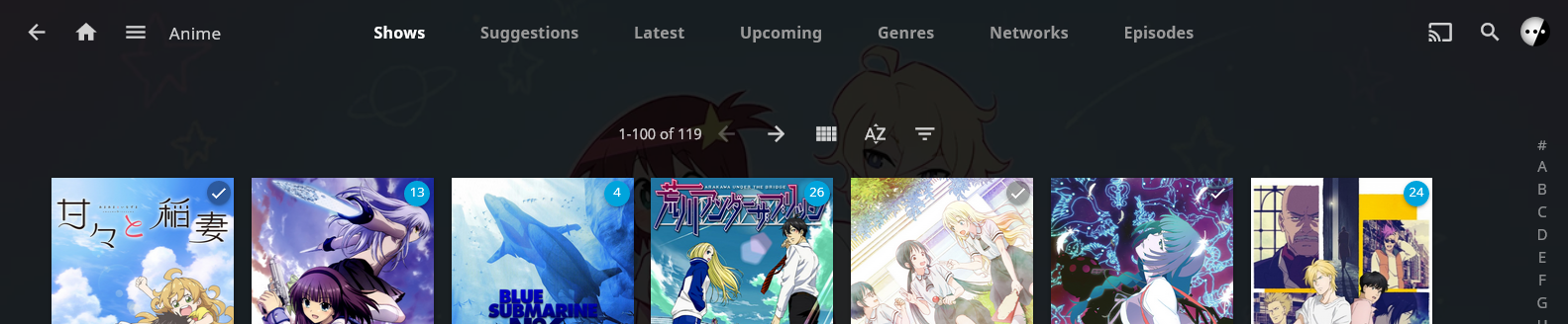
放大标签按钮(如推荐、类型分类等)。默认尺寸过小,尤其在移动端。
/* Adjust both "size-adjust" and "size" to modify size */
.headerTabs.sectionTabs {
  text-size-adjust: 110%;
  font-size: 110%;
}
.pageTitle {
  margin-top: auto;
  margin-bottom: auto;
}
.emby-tab-button {
  padding: 1.75em 1.7em;
}
增大标签按钮+透明导航栏效果:
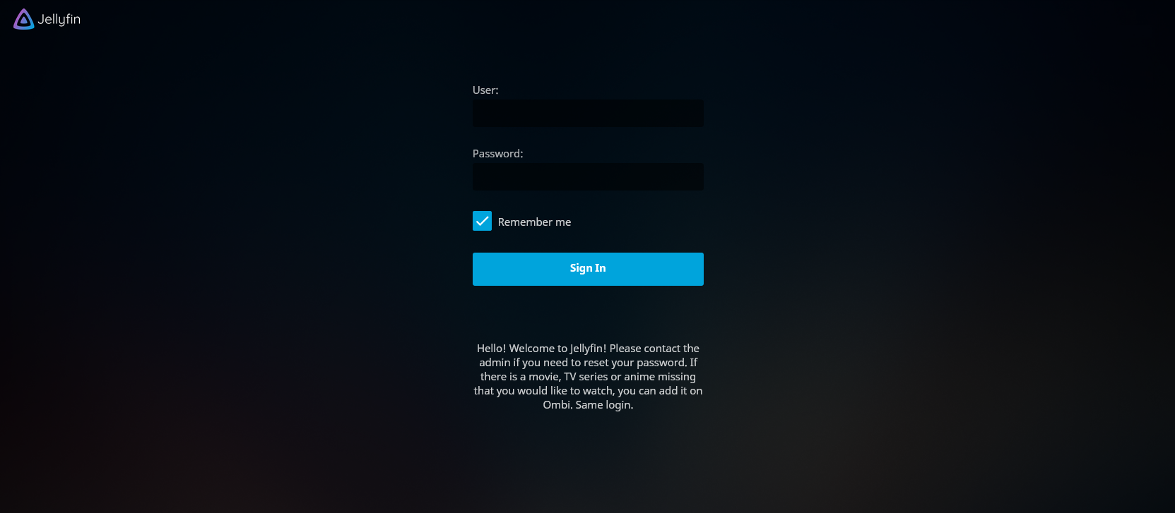
极简登录页
搭配透明顶部导航栏效果更佳!
/* Narrow the login form */
#loginPage .readOnlyContent,
#loginPage form {
  max-width: 22em;
}

/* Hide "please login" text, margin is to prevent login form moving too far up */
#loginPage h1 {
  display: none;
}
#loginPage .padded-left.padded-right.padded-bottom-page {
  margin-top: 50px;
}

/* Hide "manual" and "forgot" buttons */
#loginPage .raised.cancel.block.btnManual.emby-button {
  display: none;
}
#loginPage .raised.cancel.block.btnForgotPassword.emby-button {
  display: none;
}
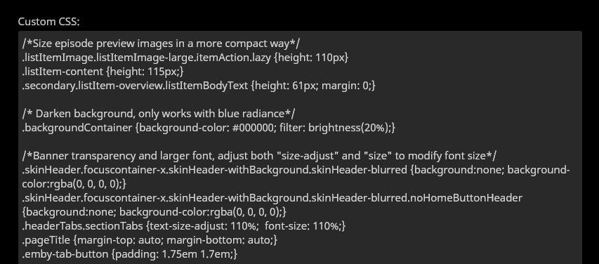
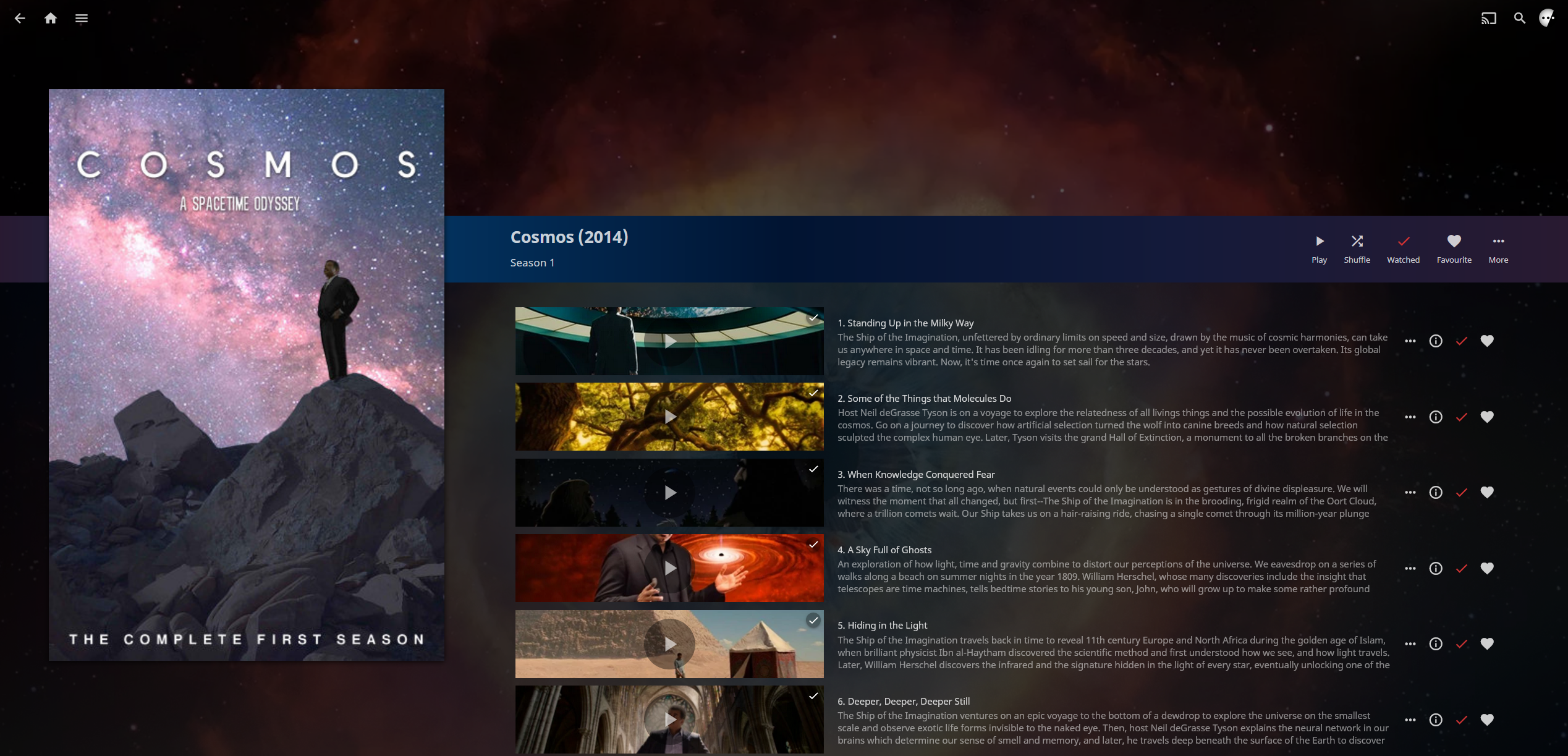
剧集预览样式优化
剧集预览在季视图中的高度由水平分辨率决定,导致大量空白区域和高垂直页面(需频繁滚动)。此代码缩减剧集条目高度,解决这两个问题。
/* Size episode preview images in a more compact way */
.listItemImage.listItemImage-large.itemAction.lazy {
  height: 110px;
}
.listItem-content {
  height: 115px;
}
.secondary.listItem-overview.listItemBodyText {
  height: 61px;
  margin: 0;
}
精简演职人员信息样式
将演职人员信息样式大幅调整为接近 Plex 的风格。此覆盖会缩小缩略图尺寸,兼容所有主题。
/* Shrink and square (or round) cast thumbnails */
#castContent .card.overflowPortraitCard.personCard.card-hoverable.card-withuserdata {width: 4.2cm !important; font-size: 90% !important;}
#castContent .card.overflowPortraitCard.personCard.card-withuserdata {width: 4.2cm !important; font-size: 90% !important;}

/* Correct image aspect ratio behavior, set border-radius to zero for square tiles */
#castContent .cardContent-button.cardImageContainer.coveredImage.cardContent.cardContent-shadow.itemAction.lazy {background-size: cover; !important; border-radius: 2.5cm;}
#castContent .cardContent-button.cardImageContainer.coveredImage.defaultCardBackground.defaultCardBackground1.cardContent.cardContent-shadow.itemAction {background-size: cover; !important; border-radius: 2.5cm;}
#castContent .cardContent-button.cardImageContainer.coveredImage.defaultCardBackground.defaultCardBackground2.cardContent.cardContent-shadow.itemAction {background-size: cover; !important; border-radius: 2.5cm;}
#castContent .cardContent-button.cardImageContainer.coveredImage.defaultCardBackground.defaultCardBackground3.cardContent.cardContent-shadow.itemAction {background-size: cover; !important; border-radius: 2.5cm;}
#castContent .cardContent-button.cardImageContainer.coveredImage.defaultCardBackground.defaultCardBackground4.cardContent.cardContent-shadow.itemAction {background-size: cover; !important; border-radius: 2.5cm;}
#castContent .cardContent-button.cardImageContainer.coveredImage.defaultCardBackground.defaultCardBackground5.cardContent.cardContent-shadow.itemAction {background-size: cover; !important; border-radius: 2.5cm;}
#castContent .cardScalable {width: 3.8cm !important; height: 3.8cm !important; border-radius: 2.5cm;}
#castContent .cardOverlayContainer.itemAction {border-radius: 2.5cm;}

/* Center the mouseover buttons */
#castContent .cardOverlayButton-br {bottom: 4%; right: 15%; width: 70%;}
#castContent .cardOverlayButton.cardOverlayButton-hover.itemAction.paper-icon-button-light {margin:auto;}
无头像演职人员列表
#castContent .card.overflowPortraitCard {
  width: 4.2cm;
  font-size: 90%;
}

#castContent .personCard {
  width: auto;
}

#castContent .personCard .cardBox {
  margin-bottom: 0px;
  margin-right: 0px;
}

#castContent {
  flex-wrap: wrap;
  max-height: 9.75em;
}

div.personCard > :first-child > :first-child {
  display: none;
}

.itemDetailPage .cardText {
  text-align: left;
}

.itemDetailPage .textActionButton {
  text-align: left;
}
自定义背景颜色
.backgroundContainer,
.dialog,
html {
  background-color: #0fd0d0;
}
调暗背景
此设置用于调暗"Blue Radiance"和"Purple Haze"主题的背景,根据您想要的暗度调整百分比。数值越低,背景越暗。
/* Darken background, only works with blue radiance */
.backgroundContainer {
  background-color: #000000;
  filter: brightness(50%);
}
右侧标题颜色
此设置用于修改右上角的演员、搜索和用户按钮的颜色。
.headerRight {
  color: yellow;
}
控制台面板自定义颜色
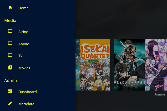
修改左侧菜单面板的颜色。
.mainDrawer-scrollContainer {
  color: yellow;
}
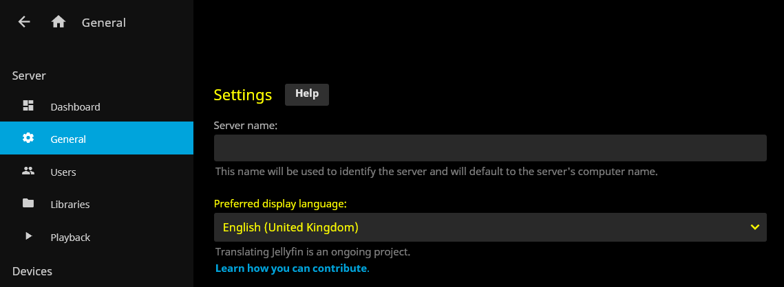
常规页面自定义颜色
.dashboardGeneralForm {
  color: yellow;
}
自定义边框颜色
此设置将更改文本框和下拉菜单的边框颜色。
.emby-input,
.emby-textarea,
.emby-select {
  border-color: #d00000;
}
此设置会影响高亮(选中)文本框和下拉菜单的边框颜色。
.emby-input:focus,
.emby-textarea:focus,
.emby-select-withcolor {
  border-color: #ffffff !important;
}
完整标题调整
.skinHeader,
.mainDrawer,
.emby-input,
.emby-textarea,
.emby-select,
.navMenuOption-selected,
.cardBox,
.paperList {
  background: #ff9475;
}
禁用库的图片轮播
此设置可使库和媒体内容整齐地显示在主页上,无需左右滚动。
@media all and (min-width: 50em) {
  .homePage .emby-scroller {
    margin-right: 0;
  }
  .homePage .emby-scrollbuttons {
    display: none;
  }
  .homePage .itemsContainer {
    flex-wrap: wrap;
  }
}
移动滚动按钮
.emby-scrollbuttons {
  position: absolute;
  left: 0;
  top: 0;
  width: 100%;
  height: 100%;
  padding: 0;
  justify-content: space-between;
  pointer-events: none;
}

.emby-scrollbuttons-button {
  pointer-events: initial;
}
"热狗与番茄酱"颜色主题示例
一个颜色主题的示例。
.skinHeader,
.mainDrawer,
.emby-input,
.emby-textarea,
.emby-select,
.navMenuOption-selected,
.cardBox,
.paperList {
  background: #ff9475;
}

.emby-input,
.emby-textarea,
.emby-select {
  border-color: #fdbe7d;
}

.backgroundContainer.withBackdrop,
.backdropContainer,
.backgroundContainer {
  background: #fdbe7d;
}

#myPreferencesMenuPage .listItemBodyText,
.emby-tab-button[data-index='0'],
#myPreferencesMenuPage > div > div > div > a:nth-child(odd),
.button-submit,
.mainAnimatedPage *:nth-child(odd),
.dashboardGeneralForm *:nth-child(odd),
.mainDrawer-scrollContainer *:nth-child(odd),
.headerRight *:nth-child(odd) {
  color: red;
}

#myPreferencesMenuPage .listItemIcon,
.emby-tab-button[data-index='1'],
#myPreferencesMenuPage > div > div > div > a:nth-child(even),
.mainAnimatedPage *:nth-child(even),
.dashboardGeneralForm *:nth-child(even),
.mainDrawer-scrollContainer *:nth-child(even),
.headerRight *:nth-child(even) .cancel {
  color: yellow;
}
浮动"正在播放"控件
/* fixed height for the bottom row */
:root {
  --element-fixed-top: 95px;
}

/* Now playing bar in the footer */
.nowPlayingBar {
       width: 650px;
       z-index: 10;
       position: fixed;
       top: 300px;
       height: 120px;
      border-style: solid;
      border-color: white;
      background-color: black;
      margin-left: 50%;
}

/* Only child of nowPlayingBar */
.nowPlayingBarTop {
     height: 5px !important;
     max-width: 500px
     top: 10px;
}

/* Song progress seekbar */
.nowPlayingBarPositionContainer {
     position: relative;
     top: 1.0em !important;
}

/* Container that holds album thumbnail, artist and album name */
.nowPlayingBarInfoContainer {
     position: fixed !important;
     left: 12px;
     top: 34px;
     height: 60px;
     width: 1100px;
}

/* Holds the next, previous track, play/pause, next and time elements */
.nowPlayingBarCenter {
     position: relative !important;
     left: 32px;
     top: var(--element-fixed-top);
     min-width: 500px;
}

/* Hold mute, volume slider container, repeat, favorite and remote control buttons */
.nowPlayingBarRight {
     width: 402px !important;
     left: -60px;
}

/* Mute button */
.muteButton {
    position: relative;
    top: var(--element-fixed-top);
}

/* Volume slider */
.nowPlayingBarVolumeSliderContainer {
     position: relative;
     left: -4px;
     top: var(--element-fixed-top);
}

/* Toggle repeat */
.toggleRepeatButton {
     position: relative !important;
     left: -20px;
     top: var(--element-fixed-top);
}

/* Favorite */
.nowPlayingBarUserDataButtons {
     position: relative;
     left: -4px;
     top: var(--element-fixed-top);
}

/* Remote control */
.remoteControlButton {
     left: -110px;
     top: var(--element-fixed-top);
}
更改图标包
您可以在 Material Icons(Jellyfin 使用的图标包)和 Fontawesome 图标之间进行选择。 Material Icons:
-
线框风格:
@import url('https://cdn.jsdelivr.net/gh/prayag17/Jellyfin-Icons/Outline.css'); -
圆角风格:
@import url('https://cdn.jsdelivr.net/gh/prayag17/Jellyfin-Icons/round.css'); -
锐角风格:
@import url('https://cdn.jsdelivr.net/gh/prayag17/Jellyfin-Icons/Sharp.css');
Fontawesome 图标:
-
实心风格:
@import url('https://cdn.jsdelivr.net/gh/prayag17/Jellyfin-Icons/Font%20Awesome/solid.css'); -
�常规风格:
@import url('https://cdn.jsdelivr.net/gh/prayag17/Jellyfin-Icons/Font%20Awesome/regular.css'); -
轻量风格:
@import url('https://cdn.jsdelivr.net/gh/prayag17/Jellyfin-Icons/Font%20Awesome/light.css'); -
双色调风格:
@import url('https://cdn.jsdelivr.net/gh/prayag17/Jellyfin-Icons/Font%20Awesome/duotone.css');
社区链接
以下是一些讨论和分享自定义 CSS 的社区链接!
社区帖子
请注意,这些社区分享内容可能基于旧版 Jellyfin 编写。部分调整方法可能已不再适用!